
Our Work
Conceptual Portfolio
Confidentiality First: We do not share client information; all examples are conceptual and never reveal real client data. Contact us to discuss your own unique project.

Cosmic UI Architecture
Modern, floating interface elements with a deep indigo metallic sheen.
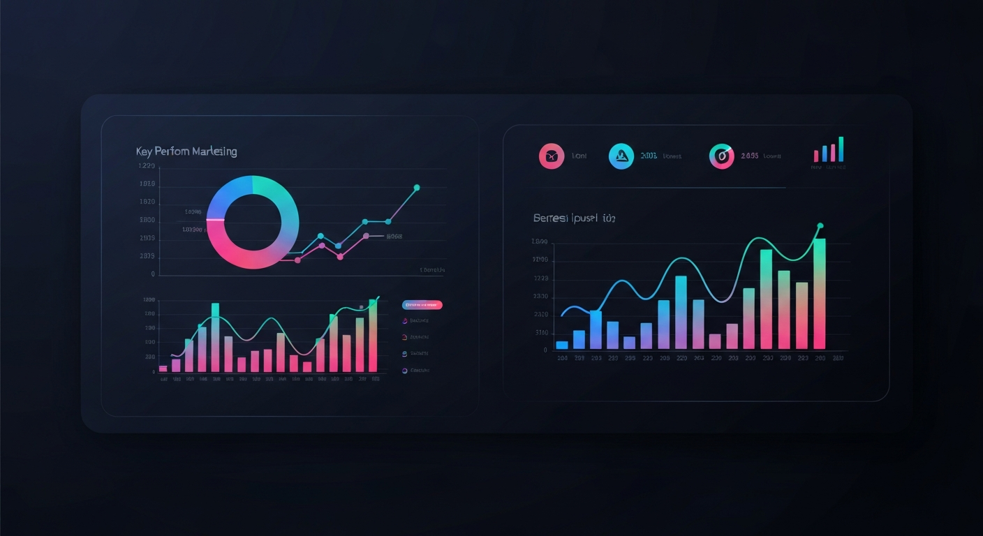
Marketing Intelligence
Data-driven dashboard concepts with vibrant charting visualizations.
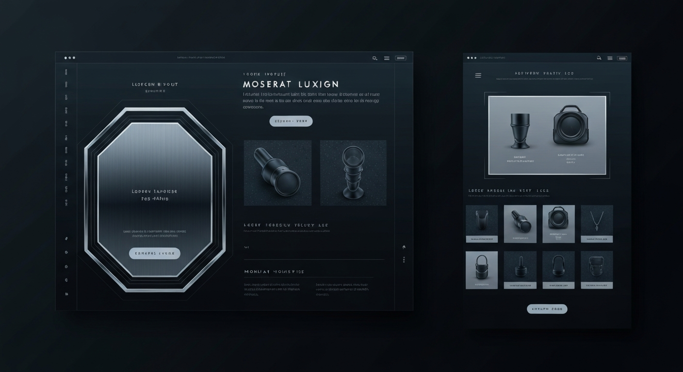
Lux E-Commerce
Sleek, conversion-optimized shopping experiences with metallic accents.
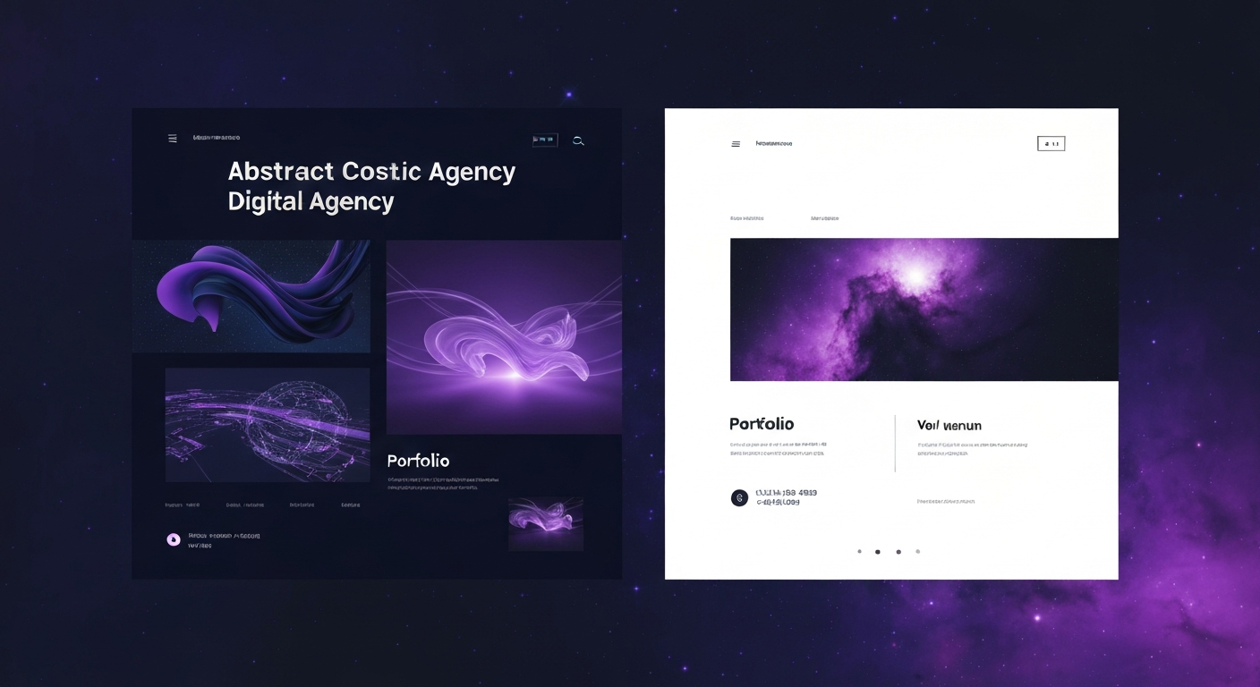
Agency Presence
Bold typography and split-screen layouts for maximum impact.
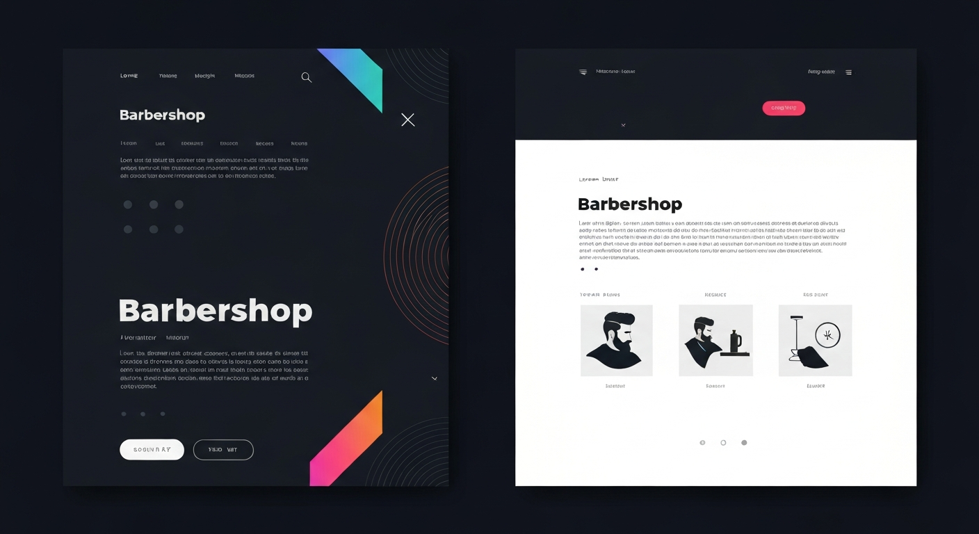
Modern Barber Shop
Sleek lines and bold accents with a dark, professional UI.
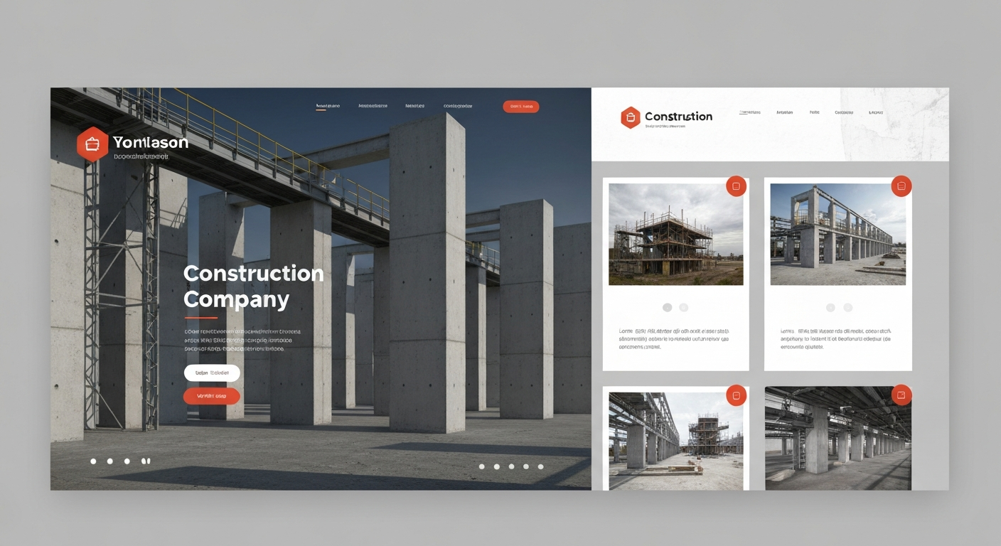
Industrial Construction
Industrial themes with structural elements and bold typography.
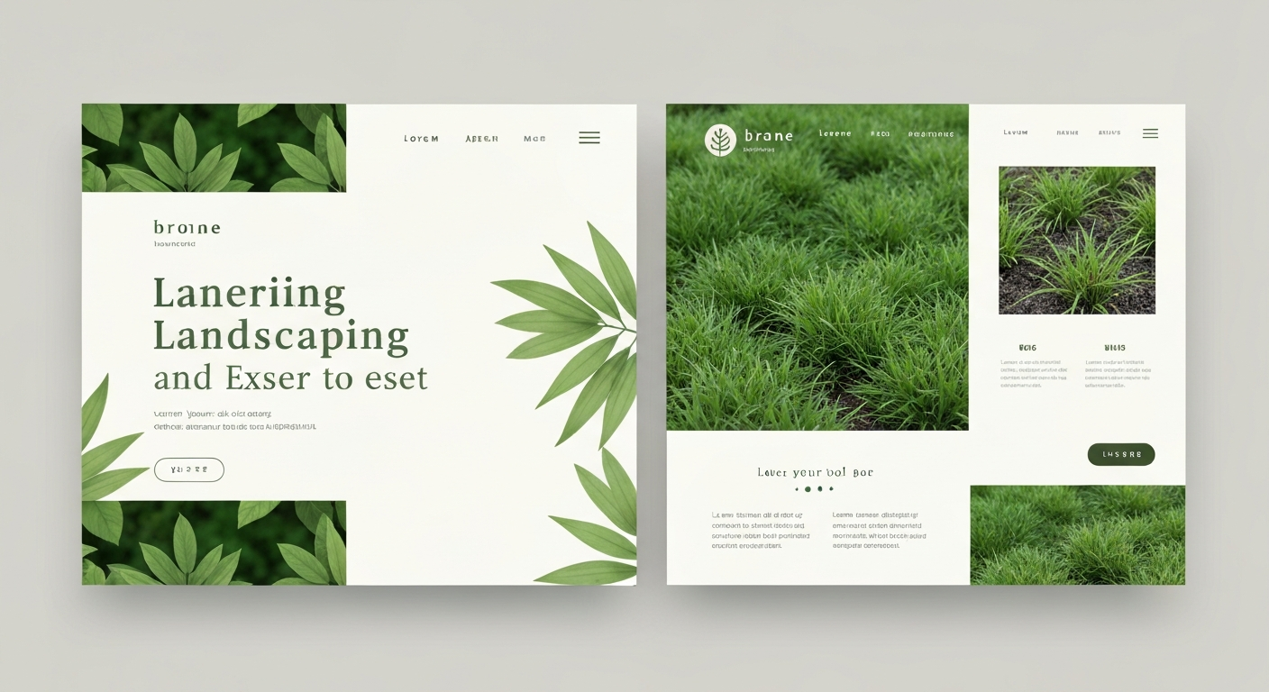
Organic Landscaping
Organic patterns and natural greens integrated into a clean layout.
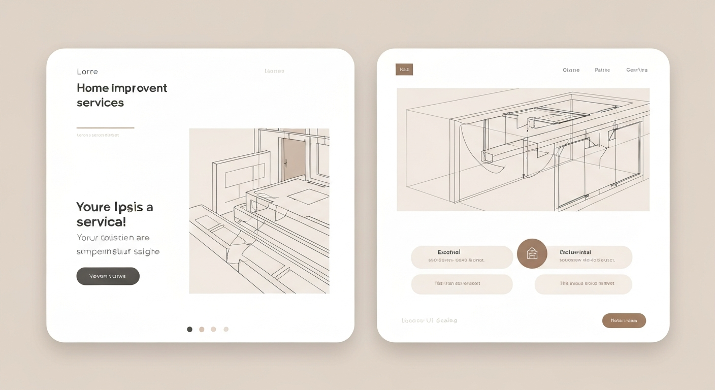
Home Improvement
Architectural lines and warm neutral tones for a welcoming feel.
Client Journeys
Strategic Transformation
Luxurious Digital Presence
"CT Digital Designs gave us a luxurious, easy-to-navigate website that boosted appointments by 30%."
Before, their outdated site failed to capture the elegance of their physical space, causing high bounce rates. We mapped out a sophisticated brand refinement strategy, utilizing a refined color palette and elegant typography to transform their online identity into a seamless, high-end booking experience.
Competitive Edge
"Our new site gave us a competitive edge, leading to a surge in partnership inquiries."
Their previous site was cluttered and failed to highlight their impressive portfolio. Through comprehensive brand refinement and the integration of high-impact visuals, we crafted an immersive platform that established them as an industry powerhouse.
Innovative Leadership
"We stand out now as an innovative leader, thanks to their tailored digital presence."
They were lost in a sea of identical tech firms with uninspired web presences. By blending dynamic micro-animations with a sleek, modern aesthetic, we developed a forward-thinking digital strategy that positioned them at the forefront of technological innovation.
E-Commerce Elegance
"Our online sales doubled after the redesign—it perfectly mirrors our in-store experience."
With a clunky checkout process and disjointed branding, they were losing online sales. We completely overhauled their digital storefront, implementing a frictionless user journey and striking visual merchandising that captivated their target audience.
Digital Vitality
"The new site captures our community's energy perfectly and makes class booking a breeze."
Their old website was slow and made booking classes frustrating for members. We introduced an energetic, organic design language paired with a highly optimized scheduling flow, resulting in a dramatic increase in member engagement.
Unforgettable Impressions
"Our portfolio finally looks as spectacular as the events we curate."
They struggled to convey the scale and beauty of their events through tiny, unoptimized galleries. We introduced a bold, cinematic layout that puts their stunning imagery front and center, instantly elevating their brand perception.
Engaging Learning Hubs
"Enrollment inquiries skyrocketed once our programs were presented clearly and beautifully."
Information overload and poor navigation were driving prospective students away. We restructured their digital architecture into intuitive, bite-sized learning paths, framed by an inspiring and accessible visual identity.
Clarity & Confidence
"Clients constantly compliment our new site—it makes complex financial planning look approachable."
Their digital presence felt cold and overly corporate, failing to build personal trust. We softened their aesthetic with warm tones and clear, concise messaging, creating a welcoming digital environment that encourages consultation bookings.
Built to Convert
"We've seen a massive increase in quote requests thanks to the streamlined new design."
A lack of a centralized portfolio meant they were losing out on showcasing their best work. We built a robust, image-forward site with strategic call-to-actions, turning casual browsers into eager prospects.
Journeys Begin Here
"The website itself feels like a vacation. It's stunning and incredibly easy to use."
Their previous site relied on generic stock photos and complicated booking forms. We curated a breathtaking, immersive visual experience paired with a seamless inquiry process, capturing the essence of luxury travel.
Compassionate Care Online
"Patients find the new site so much easier to navigate when they need urgent information."
Cluttered navigation made it difficult for patients to find basic services and forms. We implemented a clean, calming aesthetic with highly accessible information architecture, prioritizing patient experience and trust.
Amplifying Impact
"Donations and volunteer sign-ups have never been higher. The site truly tells our story."
Their mission was getting lost in walls of text and confusing donation flows. We redesigned their platform around powerful storytelling and frictionless giving mechanisms, dramatically increasing community engagement.
Digital Curb Appeal
"The before-and-after galleries on our new site have completely transformed our lead generation."
They lacked a professional way to showcase their dramatic outdoor transformations. We introduced lush, organic design elements and interactive portfolio features that perfectly mirror the quality of their physical work.
Sharp & Sophisticated
"Our aesthetic is finally represented online. The vibe is exactly what our shop feels like."
Relying solely on social media, they lacked a centralized hub for their brand. We crafted a dark, edgy, and ultra-modern digital presence that streamlined bookings and solidified their local reputation.
A Feast for the Eyes
"The new digital menu and reservation system have revolutionized how we handle busy nights."
PDF menus and a lack of mobile optimization were frustrating hungry customers. We delivered a mouth-watering, mobile-first experience with integrated reservations, ensuring a seamless journey from screen to table.
Frictionless Shopping
"Cart abandonment dropped significantly after the redesign. It's so fast and intuitive."
A slow, disjointed checkout experience was severely impacting their bottom line. We engineered a lightning-fast, visually stunning storefront optimized for high conversions and brand loyalty.
Framing Perfection
"Our work has never looked better. The site gets out of the way and lets the photos speak."
Their previous portfolio was bulky and slow to load, degrading image quality. We built a minimalist, high-performance gallery system that showcases their art with pristine clarity and elegant transitions.
Curated Experiences
"It feels like walking through a digital exhibition. Absolutely breathtaking."
They struggled to translate the physical presence of their art into a digital format. We adopted an editorial, museum-like layout with generous whitespace, allowing the artwork to command complete attention.
Spatial Harmony
"Clients can instantly see our design philosophy the moment they land on the page."
Their site felt dated and didn't reflect their modern design sensibilities. We applied their own principles of balance and proportion to their website, creating a chic, immersive digital portfolio.
Disruptive Presence
"Investors were immediately impressed by the professionalism and innovation of our new site."
They had a groundbreaking product but a generic, confusing landing page. We distilled their complex value proposition into a striking, easy-to-understand narrative backed by cutting-edge web GL animations.
Leading by Example
"We finally have a website that proves we know exactly what we're doing."
As marketers, their own site was ironically neglected and underperforming. We completely rebooted their brand with bold typography and undeniable social proof, turning their site into their best salesperson.
Digital Romance
"Brides tell us they chose us just from the feeling they got browsing our website."
They needed a way to convey emotion and meticulous organization simultaneously. We paired soft, romantic aesthetics with incredibly clear service breakdowns, building instant emotional connections.
Premium Listings
"High-net-worth clients expect the best, and this website delivers exactly that."
Standard property templates were cheapening their multi-million dollar listings. We crafted a bespoke, high-end digital experience featuring cinematic video tours and sophisticated typography.
Strategic Authority
"The new site positions us as true thought leaders in our industry."
Their expertise was hidden behind walls of dense, unreadable text. We streamlined their messaging into punchy, actionable insights framed by a sharp, corporate-yet-modern design.
Structural Elegance
"The website reflects the exact precision and creativity we bring to our buildings."
Their online portfolio was fragmented and difficult to navigate. We introduced a highly structured, grid-based design that mirrors architectural blueprints, showcasing their projects with monumental scale.
Empowering Connections
"I've seen a huge spike in discovery calls. The site feels so personal and inviting."
They struggled to convey their unique coaching style through a generic template. We built a deeply personal, vibrant brand identity that fosters trust and makes taking the first step feel effortless.
High-Impact Debuts
"The launch page generated thousands of waitlist signups on day one."
They needed to build massive hype for an upcoming product with limited information. We created a sleek, mysterious, and highly interactive teaser page that drove unprecedented anticipation and lead capture.
Setting the Scene
"Realtors instantly understand the value we add when they see our digital portfolio."
They needed to prove that staging sells homes faster, but lacked the visual proof online. We implemented interactive before-and-after sliders and a chic aesthetic that highlights their transformative power.
Bespoke Environments
"Our digital presence is now as curated and exclusive as the spaces we design."
Their portfolio was blending in with mid-market designers. We elevated their brand with a highly editorial, magazine-style layout that screams exclusivity and unparalleled taste.
Commanding the Stage
"Event organizers take me much more seriously now. The branding is top-tier."
Their personal brand lacked a cohesive, professional hub outside of social media. We created a dynamic, media-rich platform that highlights their speaking reels and streamlines booking inquiries.
Impenetrable Trust
"Enterprise clients immediately recognize us as a formidable, secure partner."
They needed to communicate absolute security without feeling archaic. We deployed a sleek, dark-mode 'tech-noir' aesthetic that feels highly advanced, reassuring, and completely modern.
Visionary Blueprints
"The seamless interface allows our avant-garde concepts to take center stage."
Their innovative designs were being overshadowed by a cluttered website interface. We stripped away the excess, delivering an ultra-minimalist digital canvas that lets their architectural visions breathe.
Foundations of Excellence
"Clients can practically feel the quality of our craftsmanship through the screen."
They had incredible physical craftsmanship but a cheap-feeling digital presence. We bridged the gap with rich textures, expansive galleries, and a narrative-driven approach to their building process.
Boundless Imagination
"Our website is now our greatest case study. It’s bold, weird, and completely us."
They were playing it too safe online, failing to reflect their true creative edge. We threw out the rulebook, injecting bold asymmetrical layouts, vivid colors, and unexpected interactions that perfectly capture their spirit.